New Year, New Look: Restaurant Website Design Inspiration for 2018
A roundup of our favorite restaurant website redesigns
Just as your restaurant evolves over time, so too should your website. With the new year in full swing, there’s no better time to think about redesigning your website to fit the current look, feel and needs of your business. We’ve rounded up some of our favorite restaurant website before and after transformations to spark some ideas as you reimagine your restaurant online.
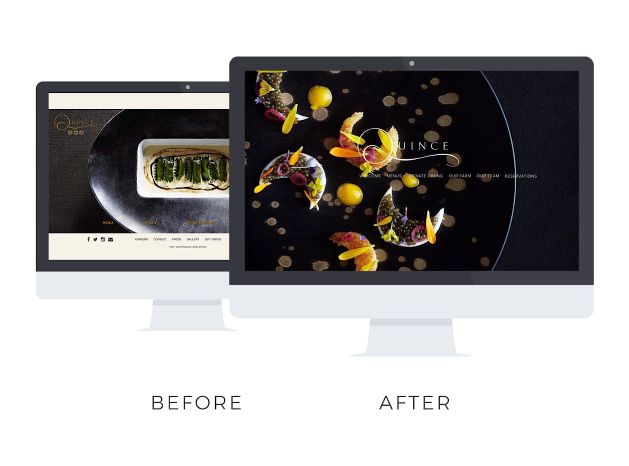
Before: Quince is a popular Michelin Star-ranked restaurant in San Francisco, yet their website felt unorganized and didn’t reflect the look and feel of their operation. Updating their old website was a slow and cumbersome process that could take hours, and took the operators away from their business.
After: With their redesign, Quince now has an elegant, refined website that matches the food and ambiance of the restaurant itself. Plus, with BentoBox, they can easily update menus, hours, photos and more on their own— in just minutes.
The best part: Quince has two distinct dining areas, the Dining Room and the Salon. With their new website, they can post separate menus on different landing pages for each room, cutting down on guest confusion when reserving.
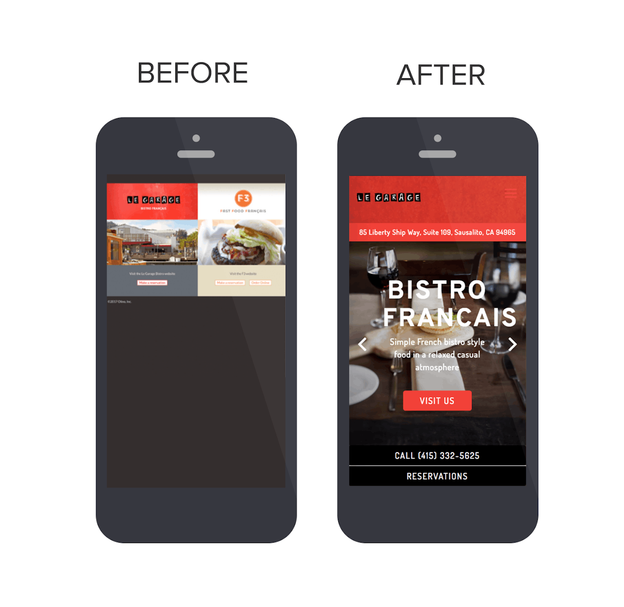
Before: While Le Garage in Sausalito, CA had a website, it wasn’t mobile-friendly, which made it extra difficult for guests to find key information like reservations, menus and hours. They also had no online gift card sales, limiting customer’s ability to purchase to either over the phone or in person.
After: Now Le Garage has a website that is completely responsive, allowing guests to quickly and easily find the information they need. And by offering gift cards on their new website, Le Garage can earn revenue from guests who can purchase them 24/7.
The best part: They integrated reservations, so guests can now book directly from Le Garage’s website, rather than having to click out to a third-party website, creating a smoother experience overall.
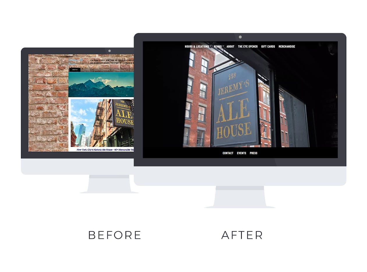
Before: While Jeremy’s Ale House in Manhattan sells merchandise in their restaurant, their online store was outdated and created a frustrating experience for their guests.
After: With their resigned website, Jeremy’s added photos and easy checkout options to their online store. They also started selling gift cards on their website, giving them a new opportunity for revenue.
The best part: Before, Jeremy’s Ale House didn’t even have access to their website login and password because they used a third party to build and manage it. Updates could take months, or never happen at all. Now they have full control of their own site and can make updates in a flash.
Kyirisan
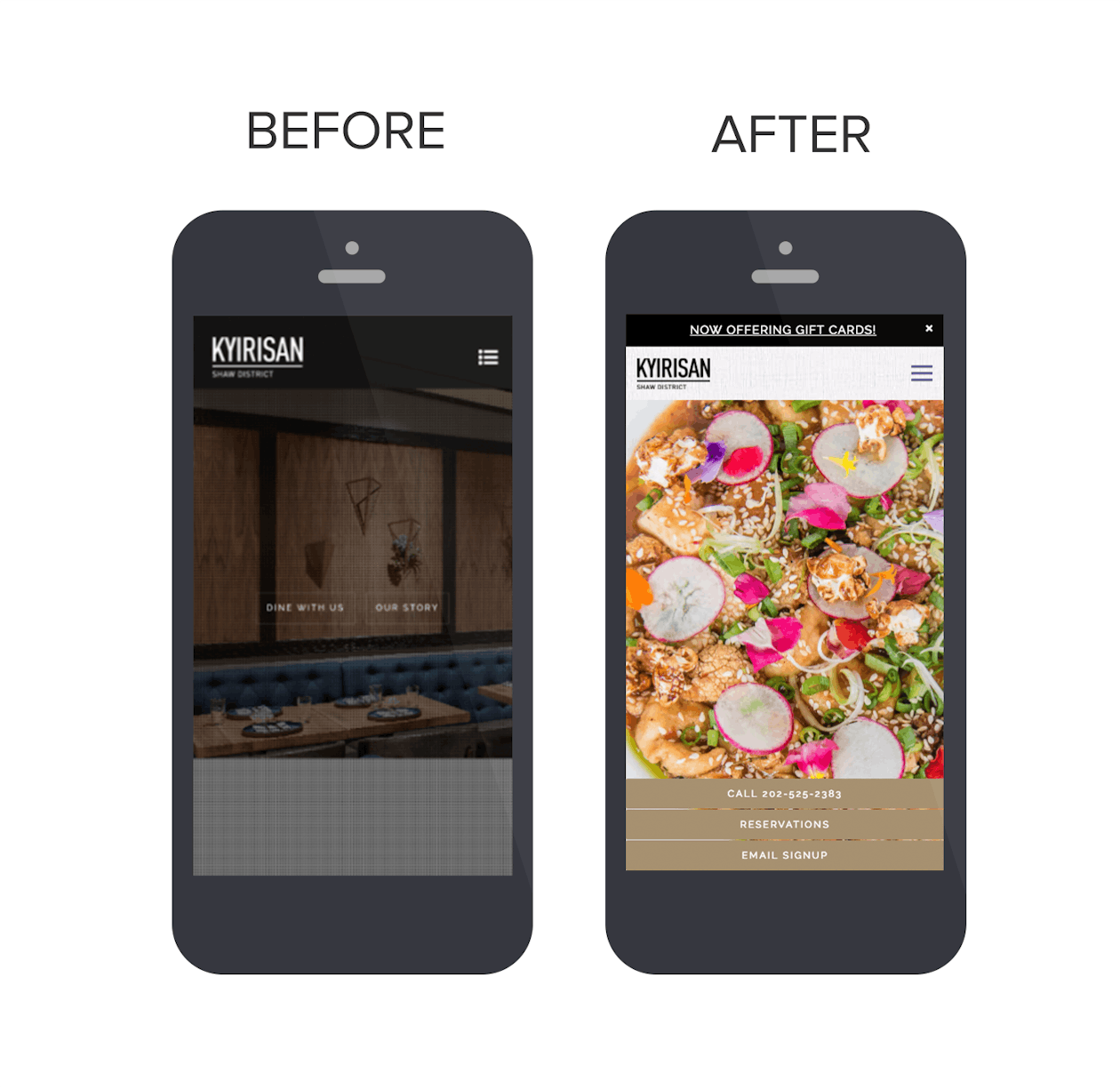
Before: Even though hosting events is crucial to the restaurant, Kyirisan's website didn’t have any event information listed. Guests were left to learn about events by word of mouth, or when they happened to be dining in.
After: Now this widely respected restaurant in D.C. clearly features all their events on their website. For private events, they’ve even added an inquiry form so guests can seamlessly request bookings online, without having to email separately.
The best part: Kyirisan added homepage notifications to their website, which helps them easily communicate important information— updated hours, special events, and so on.
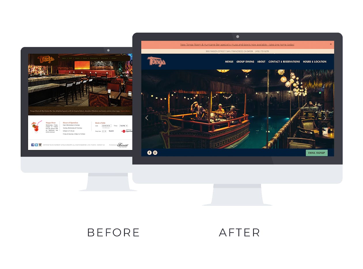
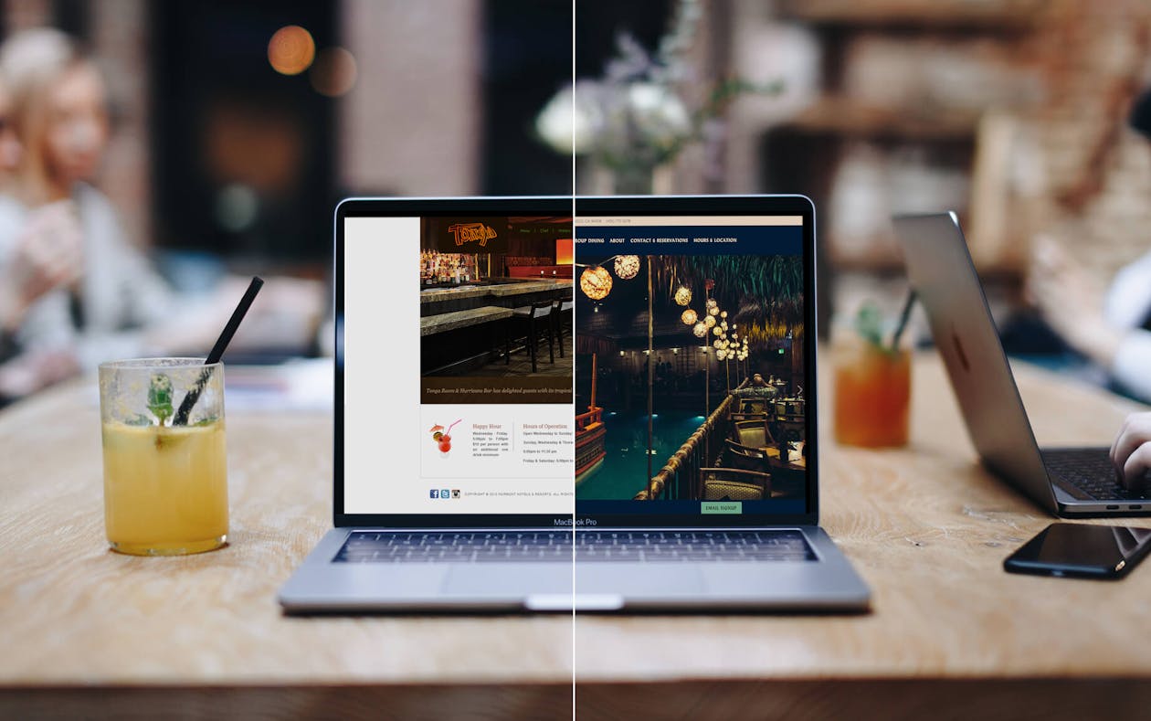
Before: Before their redesign, the Tonga Room had a website that was confusing to guests. While this classic tiki bar is part of the iconic Fairmont Hotel in San Francisco, its website had a generic feel and was cluttered with too much information.
After: Tonga Room has streamlined its website so that guests can easily find the most important information. They’ve also brought in more color and vibrant photography, so the tiki experience starts for guests the moment they find them online.
The best part: Tonga Room has added a bright email signup button to their website. It helps them grow their email list and engage with guests even from afar.
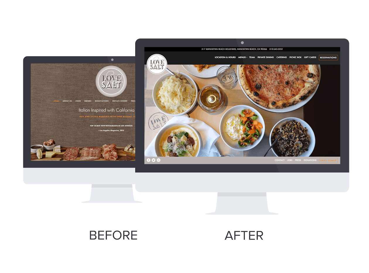
Before: Love & Salt offers event catering, yet their old website didn’t mention this service anywhere. Guests couldn’t learn more about this offering online, and the restaurant may have missed out on potential catering business.
After: They’ve now added a designated section for catering on their website, with an inquiry form that allows guests to easily get in touch and submit and order online.
The best part: Love & Salt uses Instagram as a tool to engage with their guests. With over 20k followers they now feature all their posts on their website, as well as links to their other social media channels so it’s easy for guests to find and follow them.
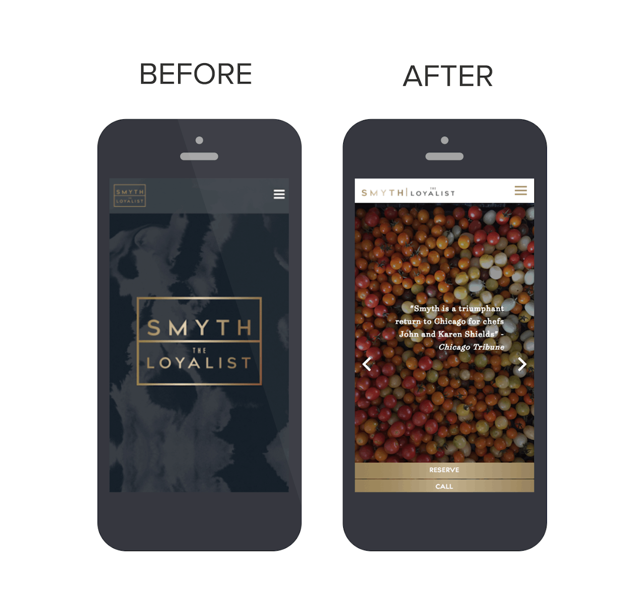
Before: Smyth & The Loyalist wanted to do more with ecommerce, but their previous website didn’t connect with any type of online payment processing. They also felt that their website didn't capture the spirit of their brand.
After: Smyth & The Loyalist now have a website that meets their ecommerce needs with a fully integrated payment processor that helps them sell gift cards online. They also have a more photo forward look that shows the connection they cultivate between the farms they work with and the food they serve.
The best part: With praise from The Michelin Guide, Bon Appetit and the Chicago Tribune, Smyth & The Loyalist has added a Press section to their website to highlight their glowing reviews.
Let's chat.
We'll help you drive revenue, directly through your restaurant's website.