
More than 50% of restaurant website visitors now arrive via mobile, and a recent study revealed that many guests search while they’re on-the-go, with the intention to act upon what they find.
In fact, 50% of consumers who execute a local search on their mobile device (in layman’s terms: their phones or tablets) visit that location within a day, whereas only 34% who check it out on their computer do the same. What does this mean? That people who are looking for restaurants on their phones are very motivated to dine out.
As a restaurant owner, this is good news for you, but it’s important to make your mobile experience as effortless as possible since this is the first impression prospective guests will get from your restaurant. With that in mind, we’ve put together this quick guide to ensure that your guests have a seamless experience from their mobile search all the way to stepping through your restaurant’s doors.
Understanding a Responsive Mobile Website
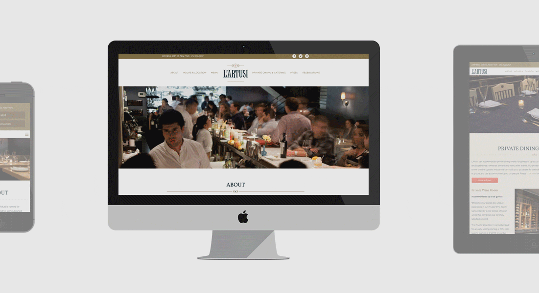
L'Artusi's responsive website.
There’s a big difference between having a mobile version website and a responsive mobile website. The former is an alternate version of your website made specifically for mobile devices, whereas the latter is the same website that adjusts and adapts to the appropriate device. It’s also Google’s recommended web design.
As a restaurant owner, a mobile version site can negatively impact your business in several ways: first off, you’ll have to do more work any time you add or remove something from your site because both sites do not update simultaneously. Furthermore, Google ranks your mobile version website lower in search results, and finally, it creates a poor user experience. Responsive website design allows for an easy transition between tablet, desktop, and mobile by adjusting images, font sizes, layout, and navigation functionality to best accommodate guests visiting your website, no matter where they’re coming from.
Mobile Website Practices
When investing in a mobile website for your restaurant, there are a few key elements and practices to keep in mind.
Keep Responsive in Mind
It is important to remember that your guests will be looking at your website through various screens—tablets, desktops, and mobile devices—and most of these screens will be smaller than a desktop screen, which emphasizes the need to prioritize content.
Look at your website and ask yourself if everything on it is absolutely necessary. If it’s not, get rid of it. Keeping things simple makes it easier for your guests on mobile devices and tablets, and also allows for a streamlined website across all devices. Develop a content strategy that keeps small screens in mind first, which will help eliminate unnecessary clutter.
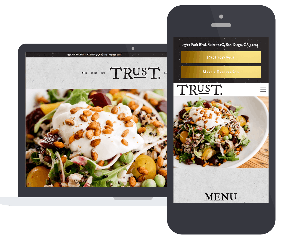
What Trust Restaurant's website looks like on a laptop and on a mobile device.
Make it Touch Friendly
When considering your mobile web design, make sure it can be navigated by fingers of all different sizes. Anticipate every single detail on your website, just as you would in your restaurant. Prevent potential frustration by making buttons and text links easy to click on small screens.
This also means sacrificing certain cool features like mouseovers and hover effects in order to move toward mobile. Be conscious of the fact that most of your guests are going to be on their phone—optimize it so that they can have a good experience.
The Faster, The Better
Just as guests aren’t incredibly patient when waiting for a table, they’re not very patient when waiting for a menu to load on your website, either. To ensure faster load times, you need to consider:
The image sizes: under 500(k).
Numbers of fonts used: don’t use too many custom fonts, which clutters the display.
The amount of content on a page: less is more.
This also means that it’s time to ditch the PDF menus. Your menu needs to be quickly and easily accessible, and due to mobile web browsing, a downloadable menu not only slows load time, but it’s also a bad overall experience for the guests, who have to then pinch and zoom in to actually read your menu. On certain phones, like Androids, PDFs don’t even open. HTML menus are the best option for mobile, especially since Google recognizes the words in the menus, which means they are searchable and closer to the top of search results.

Salon Restaurant's website on a mobile device.
Lastly, Stay Hospitality Focused
Moving toward responsive, mobile-friendly design is a great decision for any business and particularly great for restaurants. As your guests search on-the-go, make it easy for them to book a table, find your location, look up your menu, order online and/or give your restaurant a call. All of this information should be accessible on the homepage through quick links.
If you anticipate everything your guests need online, it will quickly translate into more reservations, more guests coming through your doors, and drive revenue for your restaurant. Target these guests that are searching on-the-go since these are your most motivated diners. Don’t let a poor mobile website deter them! Encourage these guests and ensure that they experience your hospitality to its fullest potential—both online and off.
Let's chat.
We'll help you drive revenue, directly through your restaurant's website.