The Best Minimalist Restaurant Websites
A roundup of our favorite minimalist restaurant website designs
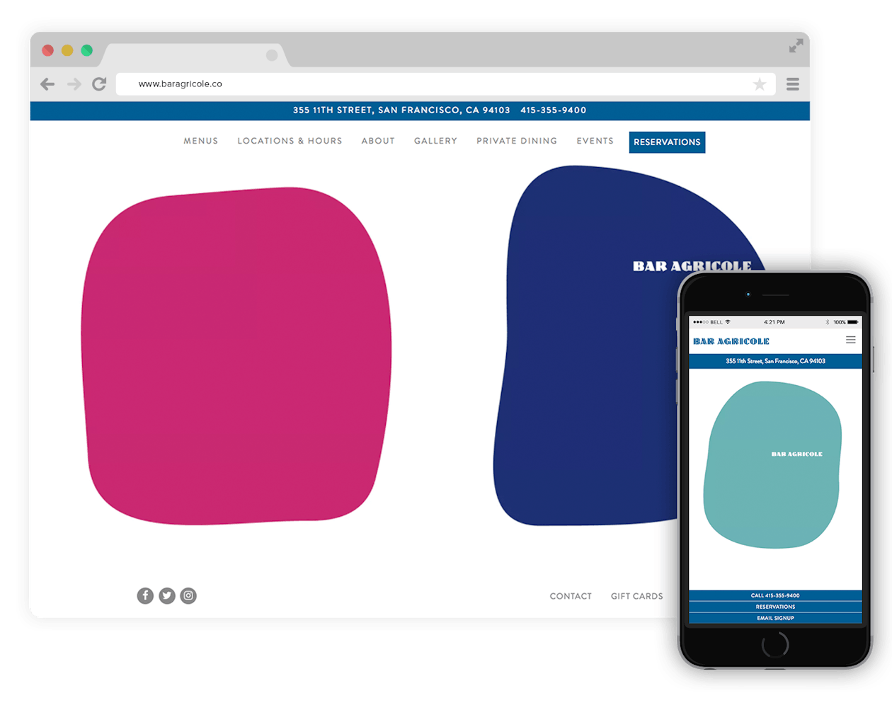
This clean website combines traditional concepts and contemporary elements, including colorful shapes that mimic the art inside the restaurant itself.
Dear Irving
New York, New York
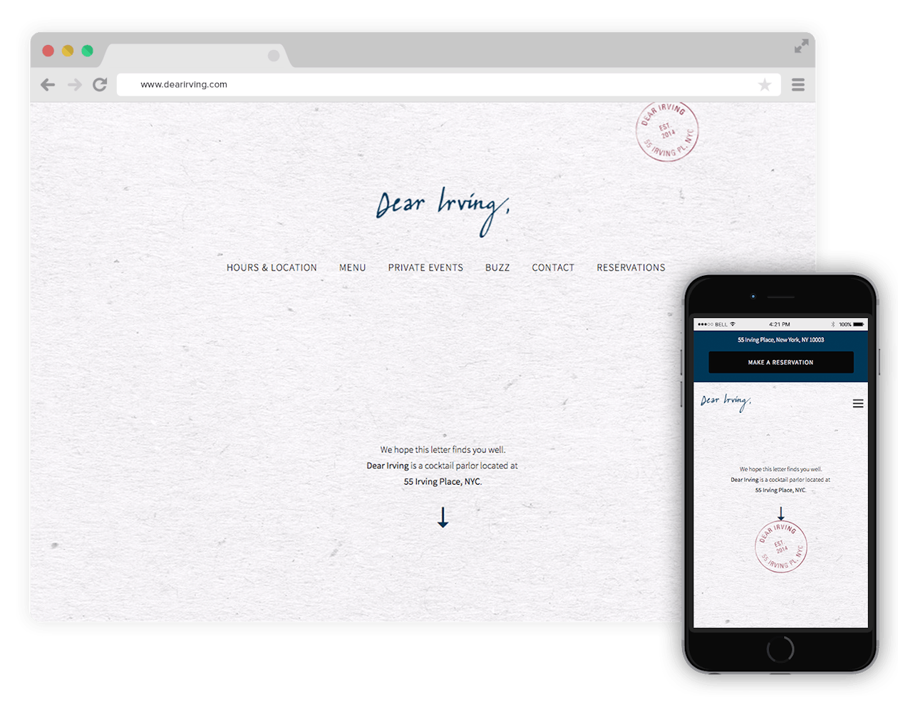
We’ve said it before, and we’ll say it again—the cool, neutral color scheme on this postage-themed website, along with the gentle script, captures this cocktail bar’s elegant, timeless feel.
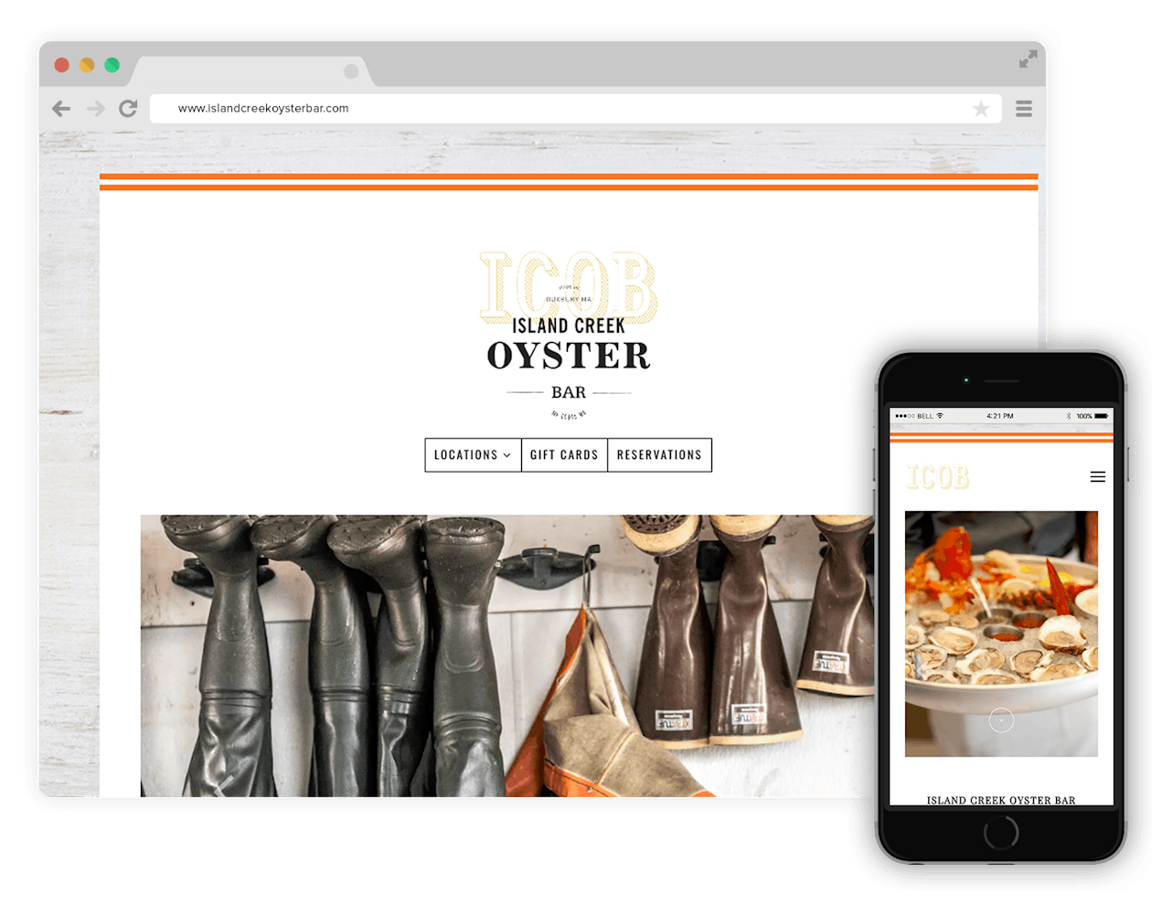
This website’s minimal background allows for the striking photography of fishermen, ocean life, and the restaurant’s food to stand out, letting visitors know right off the bat that Island Creek places seafood first.
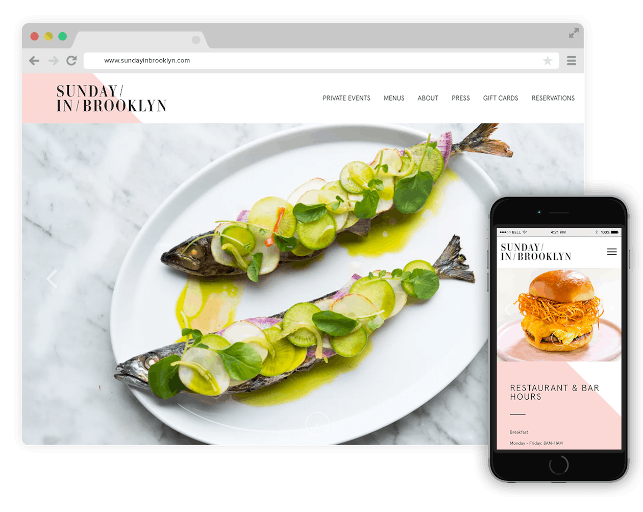
The white stucco walls, geometric planters, and airy California vibe that Sunday in Brooklyn displays in their space is also captured on their modern, angular website.
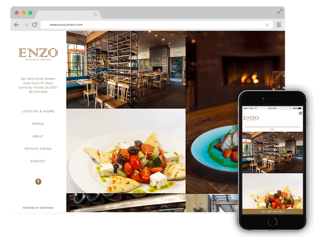
At Enzo, Southern Italian food meets a contemporary rustic setting. Their simple, photo forward website reminds visitors of the restaurant's cosy, yet elegant vibe.
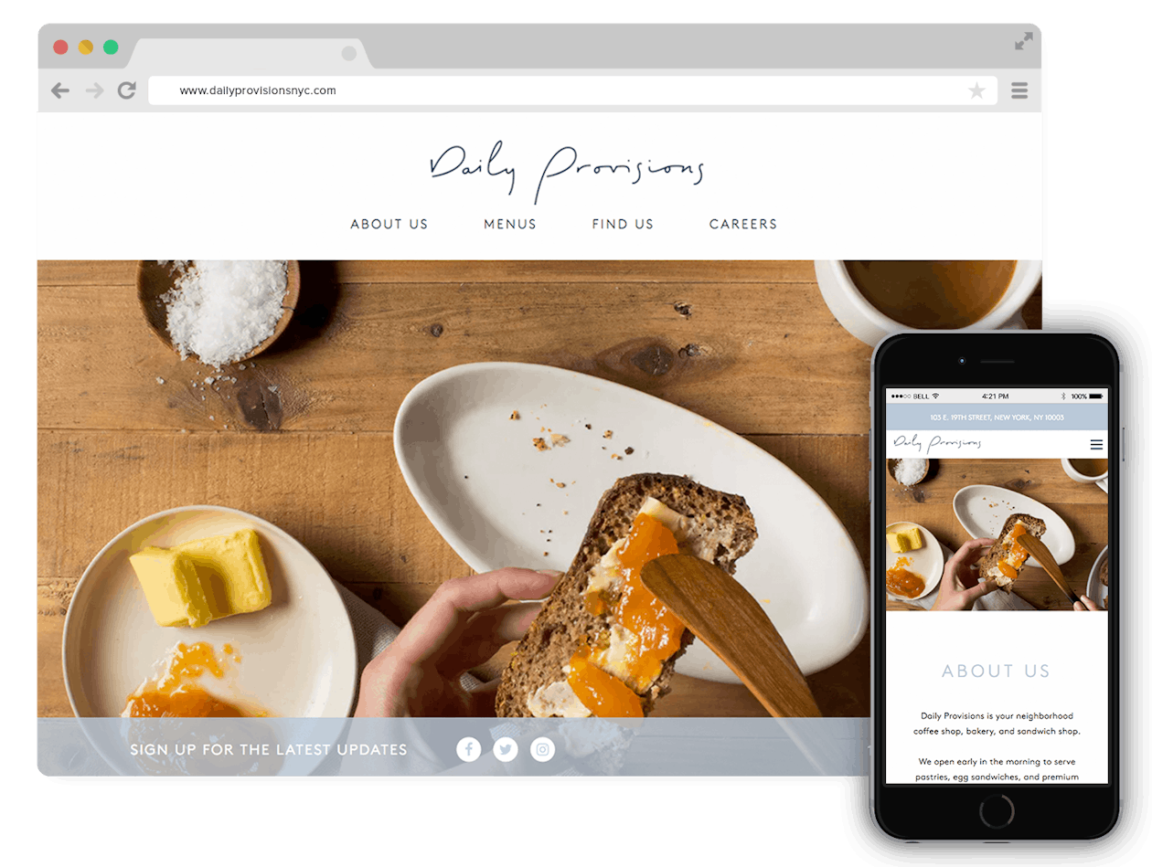
The neutral background lets the gorgeous photography of baked goods, coffee, and fresh bread stand out on the website for Danny Meyer’s latest.
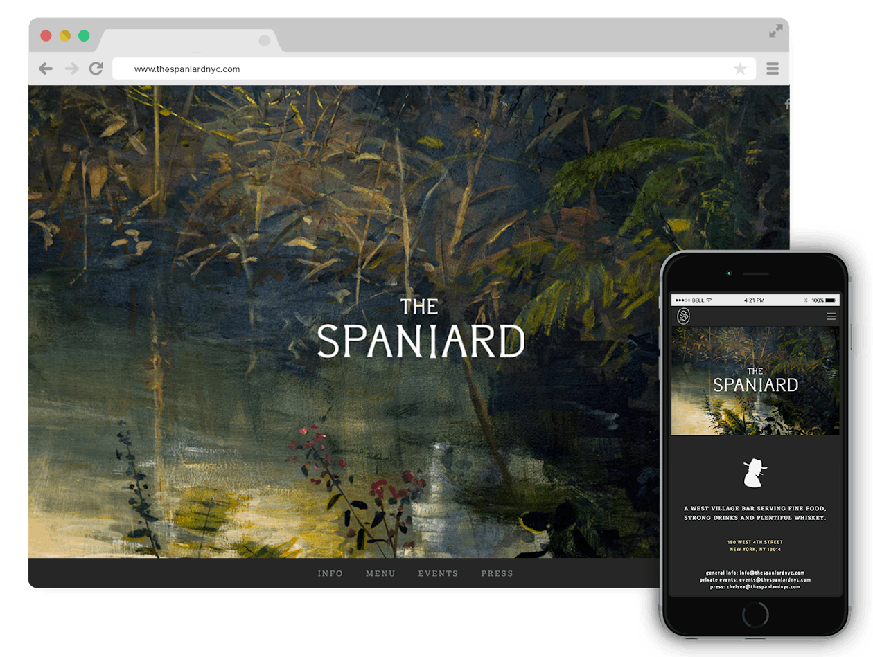
The Spaniard’s website is a good example of how minimal doesn’t have to mean lots of white, negative space. The dark, streamlined colors on this website, along with straight-to-the-point information, makes this bar seem both fun and elegant.
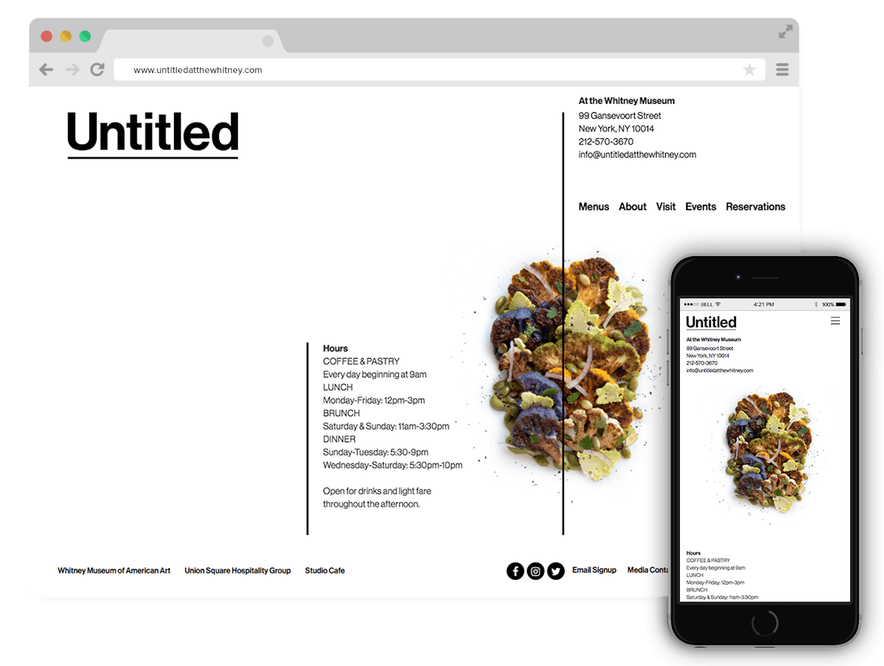
Untilted at the Whitney is on the ground floor of the beautiful museum. The elegant simplicity of this website gives off an art gallery feel, while letting the restaurant’s stunning food stand out.
Let's chat.
We'll help you drive revenue, directly through your restaurant's website.